News
Sixty Years So Far: The Grateful Dead’s Enduring Legacy Through a Psychedelic Lens
Jun
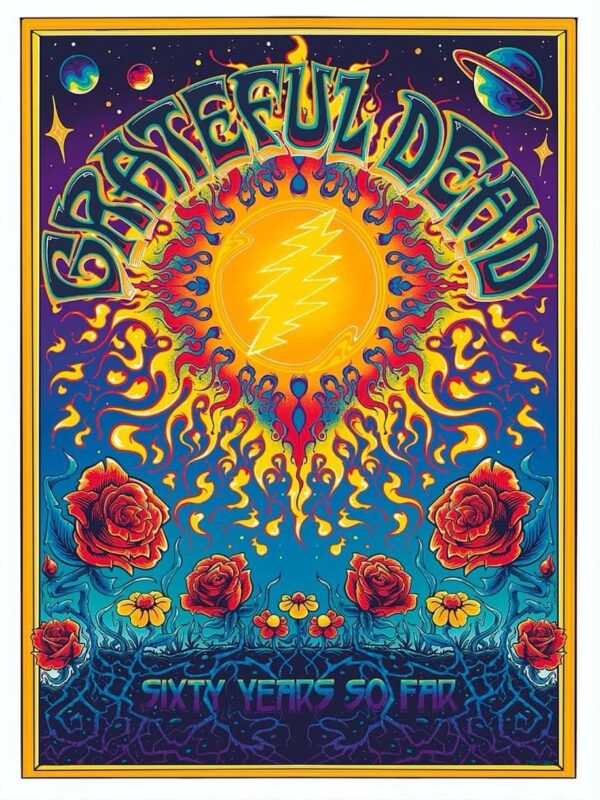
Few bands in history have carved a cultural legacy as deep and colorful as the Grateful Dead. Six decades since their inception, the band’s name still echoes across generations — not just through sound but also through iconic visual art. The poster titled “Sixty Years So Far”, a recent tribute to their legacy, encapsulates this longevity in a swirling kaleidoscope of roses, planets, and burning suns.
More than a commemorative print, this image serves as a vivid time capsule — a celebration of the Dead’s musical mythology and the counterculture movement it helped shape. With its bold use of color, classic symbols, and cosmic surrealism, the poster is both a work of art and a love letter to the band’s psychedelic past, present, and future.
1. A Sunburst of Sound and Symbolism
The first thing that grabs the eye is the incandescent sun at the center of the composition. In the heart of the solar flare is the unmistakable Grateful Dead lightning bolt — a 13-point zigzag split down the middle, glowing like a flash of cosmic memory. The sun’s tendrils spread outward like flames or neural signals, alluding to both energy and consciousness.
This is no ordinary sun. It’s a stand-in for the band itself — a fiery nucleus around which everything else orbits. Just as the Grateful Dead was the gravitational force pulling thousands into its live shows, so too does this blazing symbol draw all other elements into its embrace.
2. Typography With a Pulse
The words “Grateful Dead” arch overhead in a style that fans will recognize as quintessentially ‘60s. The font choice is more than aesthetic — it’s historical. This hand-drawn, warped typeface mirrors the handbills and posters that once advertised Dead shows at the Fillmore and Avalon Ballroom. It pulses with movement, as if the letters themselves are alive.
By placing this lettering above the central sun, the design implies a heavenly banner — a name that has become celestial, iconic, eternal. The movement of the letters mimics the fluidity of the band’s music, constantly shifting, expanding, never rigid.
3. A Garden of Roses: Love, Death, and Rebirth
Surrounding the lower half of the poster is a field of large, blooming red roses. This is perhaps the Grateful Dead’s most enduring symbol, pulled from the band’s association with San Francisco’s Haight-Ashbury culture and immortalized on the cover of Grateful Dead (Skull & Roses) in 1971.
Roses have always been dual symbols — beauty and pain, life and decay. In the Grateful Dead context, they speak to both the transient nature of existence and the ecstasy of experience. The roses in this poster are lush and detailed, some paired with yellow flowers that hint at spring, youth, and joyful beginnings. Below them, dark roots twist and curl like veins — tying the beauty above to the hidden world below.
This floral imagery becomes a metaphor for the Grateful Dead’s music: surface-level beauty rooted in deeper, often darker, improvisational spaces.
4. The Cosmic Frame: Planets, Stars, and Infinity
Set against a midnight backdrop dotted with stars and planets, the poster ascends from earthly roots to celestial heights. In the upper corners are orbs that resemble Saturn and distant nebulae — a nod to the band’s “spacey” jams and philosophical lyrics about time, death, and the afterlife.
The inclusion of interstellar imagery suggests that the Grateful Dead’s influence is no longer bound by geography. What began as a San Francisco phenomenon is now universal. The Dead’s music — and its accompanying artwork — exists in a time-free zone, both ancient and futuristic, deeply personal and cosmically vast.
5. The Phrase “Sixty Years So Far”: A Journey Still in Motion
At the bottom of the poster, the phrase “Sixty Years So Far” glows in a retro-futuristic font, emerging from the tangled roots like a hidden truth. It’s a humble declaration — “so far” implies the journey isn’t over.
This is not a tombstone or a retrospective. It’s a mile marker. The Dead may have lost members, changed forms, and passed through cultural eras, but the spirit is still moving forward — through surviving band members, offshoots like Dead & Company, and the ever-growing family of fans known as Deadheads.
6. Color Theory: A Psychedelic Symphony
What truly makes this poster come alive is the color palette. Flaming oranges and radiant yellows dominate the sun, giving way to electric blues, purples, and crimson reds. Each hue seems to bleed into the next, mimicking the melting visuals one might associate with an acid trip or a particularly emotional guitar solo.
This kaleidoscopic style is no accident. Psychedelia is baked into the Grateful Dead’s DNA. Their early shows often involved light projections, oil lamps, and visual experimentation. This poster pays homage to that era, translating the auditory experience of a jam session into visual form.
7. A Poster as a Portal
Posters like this are more than merch. For many fans, they are sacred objects — windows into another realm. This particular piece invites you to step inside. The layered symbols, glowing colors, and mirage-like symmetry feel less like flat art and more like a multidimensional map.
It’s a psychedelic mandala, one that doesn’t just tell you about the Grateful Dead — it is the Grateful Dead, compressed into a single image. The kind of image that might live above a record player, or inside a tour bus, or on the back of a well-worn hoodie passed between friends.
8. Legacy Through Art
The Grateful Dead’s story isn’t told through top-40 hits or stadium pyrotechnics. It’s passed down through word of mouth, through bootleg tapes, through tour posters lovingly collected and preserved. Visual art has always been central to their mythos — from Rick Griffin and Stanley Mouse in the ‘60s to new-school artists like this one, whose tribute bridges the past with the present.
In many ways, the legacy of the Dead lives on more clearly in these visual artifacts than even in their recordings. A poster like “Sixty Years So Far” doesn’t just mark a moment — it perpetuates the myth.
9. Community, Continuity, and Consciousness
Beyond the music and the visuals is something less tangible but more powerful: community. The Grateful Dead never sought stardom in the traditional sense. Instead, they built a community. And over sixty years, that community has not only survived — it has thrived.
This poster is both a gift and a message to that community. It reminds us that while the people may change, and the years may pass, the essence remains. It’s a beacon for old Deadheads and a lighthouse for new ones discovering the band for the first time.
The circularity of the design — from the fiery sun to the cosmic border — speaks to that continuity. There is no real beginning or end. Just loops. Just rhythms. Just flow.
10. Conclusion: A Bloom That Never Wilts
“Sixty Years So Far” is not merely an anniversary — it is a celebration of endurance, reinvention, and the eternal dance between sound and vision. This poster captures that beautifully. Through its vibrant design, it becomes not just a piece of commemorative art but a psychedelic scripture — an illuminated manuscript for those who speak the language of groove and soul.
The Grateful Dead may have emerged from the counterculture, but their resonance now feels timeless. And like the roses blooming eternally in the lower third of this poster, the Dead’s influence will keep sprouting, twisting, and climbing for as long as there are ears to hear and eyes to see.
As long as there is wonder.
As long as there is music.
As long as there are people willing to dance.
So here we are, sixty years so far — and still going.
>>>Enjoy shopping at Flexenteeco